What does a candlestick show?
A candlestick chart draws price as a row of candles. Each candle covers one period of time, set by the chart’s timeframe: one hour, four hours, one day or one week. Within that period, the candle records four prices, often shortened to OHLC:
- Open: the first price of the period.
- High: the highest price reached.
- Low: the lowest price reached.
- Close: the last price of the period.
Up candles and down candles
If the close is above the open, price rose during the period and the candle is an up candle. If the close is below the open, it is a down candle. Most charts colour up candles green and down candles red. In Chartle, up candles are green and down candles are dark. Green against dark also stays easy to tell apart for people with red-green colour blindness.
What bodies and wicks tell you
- A long body means price travelled a long way from open to close. One side was clearly in control for that period.
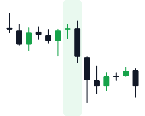
- A small body means open and close were close together. Neither side won the period decisively. A candle with almost no body is a doji.
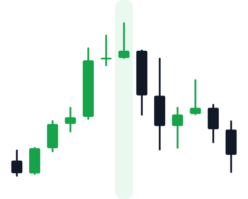
- A long upper wick means price was pushed up during the period but sold back down before the close.
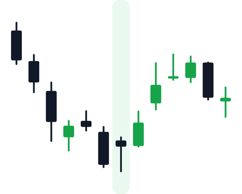
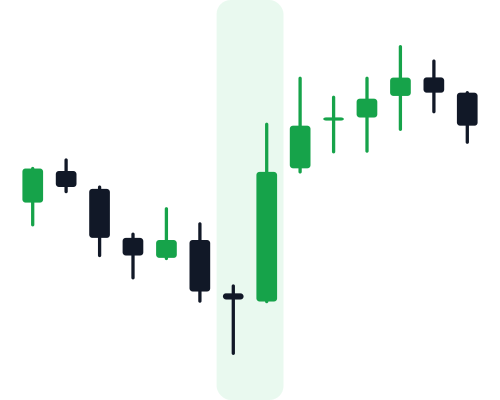
- A long lower wick means price dropped during the period but was bought back up. A long lower wick after a decline is what makes a hammer.
Read candles in context, not alone
A single candle rarely means much on its own. The same shape can say different things depending on what came before it. A hammer after a long fall is interesting; the same candle in the middle of a sideways range usually is not. When you read a chart, look at the trend first, then at where the candle sits: near a recent high, a recent low, or a level price has turned at before.
Timeframes change the picture
Zooming out changes what each candle represents. A daily candle contains everything the 24 hourly candles did that day. Patterns can show up on any timeframe, and the questions in Chartle use real charts from 1-hour up to daily candles so you learn to spot them at different zoom levels.
Candlestick patterns to learn first
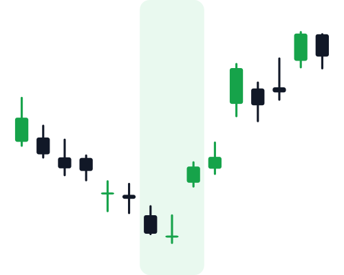
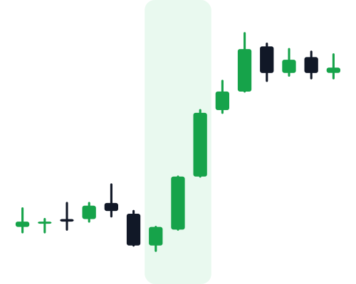
Candlestick patterns are one to three candles that often appear at turning points. These six are a good start. Each page shows real examples you can practice on.
Then move on to chart patterns
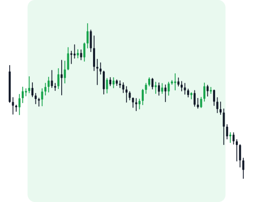
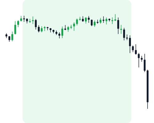
Chart patterns are bigger shapes that form over many candles, like peaks, flags and triangles.
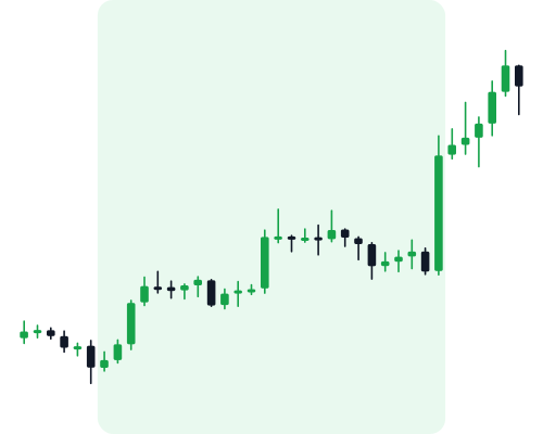
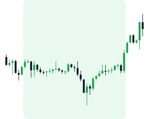
See all 49 on one page in the candlestick patterns cheat sheet.
A good habit: predict, then check
Reading about candles is the easy part. The skill comes from looking at a real, messy chart, deciding what you think happens next, and then seeing what actually happened. That is exactly how Chartle works. You can try today’s free chart right in your browser.